mapping 30-minute cities, how do our capitals compare?
- Written by David Levinson, Professor of Transport, University of Sydney
Accessibility – the ease of reaching valued opportunities such as jobs, workers and shops – is the whole reason cities exist. There is no reason to locate anywhere but to be near things, far from things, or to possess things. Access measures this.
Locations with better accessibility to urban opportunities generally have higher development density and more expensive real estate. This is because places with higher accessibility are more productive, so their workers earn higher wages. And modes of transport that reach more opportunities – that is, provide access to places where people work, live, shop, and more – tend to have higher market share.
Read more: Growing cities face challenges of keeping the masses moving up, down and across
Our new report, Access Across Australia, for the first time generates a set of consistent maps and graphs of 30-minute access to jobs and workers by each transport mode for each of the eight capital cities. This covers around 70% of the nation’s resident workers and employment opportunities.
The full report compares 10-minute to 60-minute accessibility to both employment locations and to workers’ homes by four modes of transport – car, public transport, walking, and cycling – for each city. It also reports the overall job-worker balance, comparing how many workplaces can be reached to how many competing workers want to reach those same workplaces.
The accessibility measures take into account the effects on travel times of traffic congestion and the walking and transfer elements of the public transport mode.
Accessibility captures the combined effect of land use and transport infrastructure. The faster and more direct the network, the higher the access. The more opportunities (people and places) that can be reached, the higher the accessibility.
This value varies across and between regions. For this article, we show this in maps for Sydney – the full report has maps for all four transport modes, for both jobs and labour (resident workers), for all eight cities. In the table, city-level accessibility numbers are reported as a metropolitan average, weighted by the number of people who experience that accessibility (population-weighted accessibility), to best represent the experience of the working population.
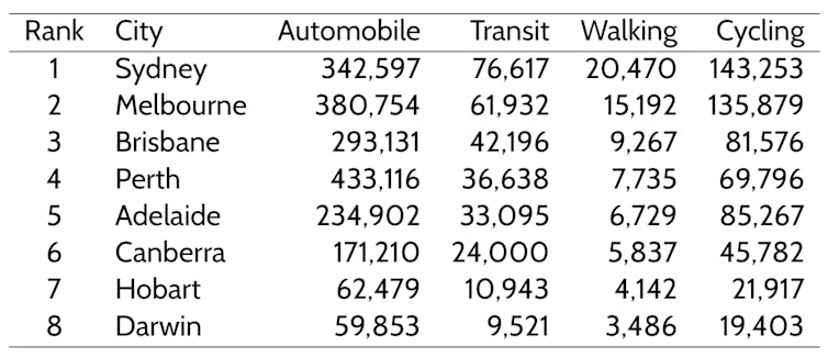 Population-weighted 30-minute accessibility to jobs; cities ranked by the size of employment opportunities.
Hao Wu and David Levinson
The rankings in the table are discussed below for each mode.
Read more: '30-minute city'? Not in my backyard! Smart Cities Plan must let people have their say
Cars
Cars have higher accessibility than public transport, walking, or cycling. Perth has the greatest number of jobs and workers reachable by car within 30 minutes.
At time thresholds of 40 minutes and longer, residents of Sydney and Melbourne have higher accessibility than other cities. During the morning peak period, Melbourne has moderately better car accessibility than Sydney, despite Sydney being larger and having more opportunities overall. This indicates that roads in Melbourne are faster than those in Sydney.
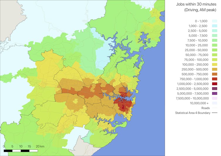 30-minute job accessibility by car in Sydney.
Hao Wu and David Levinson
Read more: Three changes in how we live could derail the dream of the 30-minute city
Public transport
Public transport accessibility incorporates time to reach transit stops and station on foot, and equals the minimum of walking and transit times between an origin and destination. It remains at a significant disadvantage compared to car travel, reaching between 12% and 18% of the urban opportunities accessible by car under a 30-minute threshold.
Public transport accessibility tends to be high in city centres and low in other places. The disparity with cars peaks at 20-30 minutes’ travel time.
Sydney and Melbourne have the best public transport accessibility among Australian cities, followed by Perth and Brisbane. It could be higher still with better-located station entrances and exits.
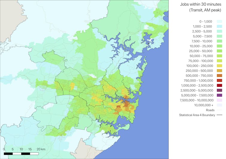 30-minute job accessibility by public transport in Sydney.
Hao Wu and David Levinson
Read more: How to increase train use by up to 35% with one simple trick
Cycling
This report identifies cycling as a viable option for improving accessibility. Assuming cyclists are willing to ride on the street, people cycling can reach about twice as many jobs as people on public transport within 30 minutes in all eight Australian cities, and around one-third of job opportunities reachable by car (except for Perth, which is 16%). Sydney and Melbourne have the highest cycling accessibility.
Of course, it should be recognised that many potential bicyclists are extremely uncomfortable riding in traffic. Their accessibility on a more limited network of residential streets and protected bike lanes would be much reduced.
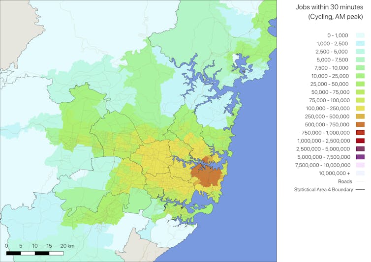 30-minute job accessibility by cycling in Sydney.
Hao Wu and David Levinson
Read more: Cycling and walking are short-changed when it comes to transport funding in Australia
Walking
People walking cannot travel as fast as those on other modes, particularly over longer distances, where public transport and cars can travel at much higher speeds. Not surprisingly, walking has the lowest accessibility of all four modes. The presence and timing of traffic signals that give priority to cars significantly reduces walking accessibility.
Walking accessibility is closely related to urban density. City centres, especially those in larger and denser cities, tend to have better walking accessibility.
Among the eight major Australian cities, Sydney and Melbourne have the best walking accessibility. Hobart and Darwin have the lowest.
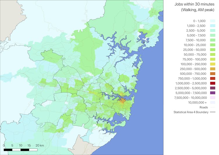 30-minute job accessibility by walking in Sydney.
Hao Wu and David Levinson
Read more: How traffic signals favour cars and discourage walking
Job-worker balance
The job-worker balance of a place is measured dynamically as the ratio of jobs and resident workers reachable within 30 minutes. City centres have superior accessibility to both jobs and workers, and less pronounced advantage in car accessibility compared to other modes. Higher jobs-to-workers accessibility ratios in city centres show that, in general, jobs are distributed closer to and better connected with city centres than residential locations.
The job-worker balance is a potent indicator for identifying urban centres and for measuring the strength of centres.
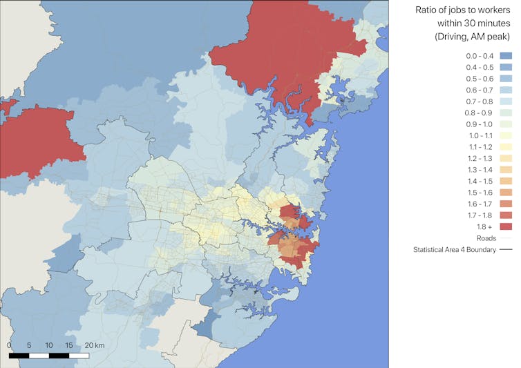 Ratio of 30-minute job accessibility to worker accessibility by car in Sydney.
Hao Wu and David Levinson
Read more: How close is Sydney to the vision of creating three 30-minute cities?
Conclusions
This research gives us a baseline accessibility measurement using the best available data for 2018. Repeating this analysis over time will enable long-run tracking of accessibility as a performance measure.
This will enable us to answer questions such as: is accessibility by a particular transport mode rising or falling? Is that due to congestion, network contraction, new infrastructure, or changes in residential or employment density? Are policies working to expand accessibility for the population as a whole, and for areas within cities? Which investments give the most accessibility “bang for the buck”?
Some of the results are surprising – in particular, the observation that the speed of Perth’s freeway and street network more than compensates for more limited scale in producing 30-minute car accessibility.
But this result is just an indicator of broader accessibility, which includes additional relevant opportunities, more times of day and more information than is presently at hand. This is likely to become more widely available in an era of big data if governments choose to actually implement the open data claims they advertise.
Authors: David Levinson, Professor of Transport, University of Sydney


