

Whichever way you spin it, Australia's greenhouse emissions have been climbing since 2015
- Written by: Tim Baxter, Fellow - Melbourne Law School; Associate - Australian-German Climate and Energy College, University of Melbourne
Let me explain how to see through the spin on Australia’s rising greenhouse emissions figures.
With the release today of Australia’s emissions data for the December 2018 quarter, federal energy and emissions reduction minister Angus Taylor has been more forthcoming than usual about the rising trend in Australia’s emissions.
There’s one small issue, though. Despite Taylor’s comments in which he sought to explain away Australia’s 0.7% year-on-year rise in emissions as a product of increased gas investment, actual emissions in the December quarter were in fact down relative to the September 2018 quarter. This is due mainly to the fact that people use much more energy for heating in the July-September period than they do during the milder spring weather of October-December.
Taylor, meanwhile, was discussing the “adjusted” data, which reveals an 0.8% increase between the two quarters.
This might all sound like minor quibbling. But knowing the difference between quarterly and annual figures, and raw and adjusted data – and knowing what’s ultimately the most important metric – is crucial to understanding Australia’s emissions. And it might come in handy next time you’re listening to a politician discussing our progress (or lack thereof) towards tackling climate change.
Read more: Australia is not on track to reach 2030 Paris target (but the potential is there)
Highlighting the difference between quarters is problematic, because emissions data are what statisticians describe as “noisy”. Emissions levels jump around from period to period, which can obscure the overall trend.
Quarterly data is important for understanding how Australia is tracking more generally towards doing its fair share on reducing its emissions. But too much stock is put on the noise, and not enough on the underlying trend.
The charts below compare our estimated actual emissions on a quarterly basis (top) with the cumulative emissions for the year leading up to that quarter (here described as the “year-to-quarter emissions” and shown in the lower chart).
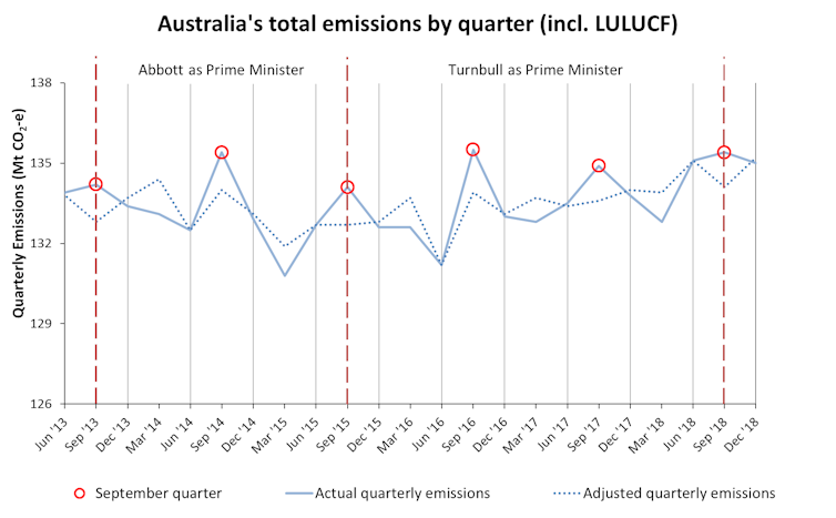 Quarterly emissions. (LULUCF stands for Land use, land-use change, and forestry.)
Dept Environment and Energy (data)
Quarterly emissions. (LULUCF stands for Land use, land-use change, and forestry.)
Dept Environment and Energy (data)
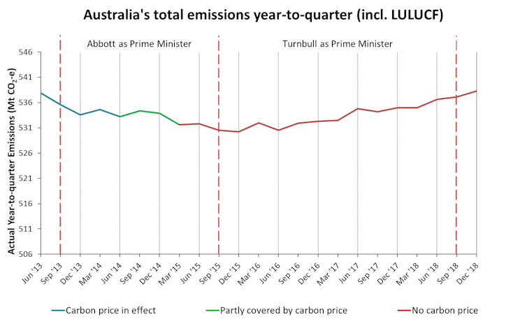 Year-to-quarter emissions. (LULUCF stands for Land use, land-use change, and forestry.)
Dept Environment and Energy (data)
Year-to-quarter emissions. (LULUCF stands for Land use, land-use change, and forestry.)
Dept Environment and Energy (data)
These charts, both built on today’s data, make a few things clear.
Quarterly emissions are noisy
The first thing to note is that saying that our emissions are down compared with the previous quarter is hardly remarkable, or worth patting ourselves on the back for. This is especially true if we are comparing the December quarter data, released today, with the data for the preceding quarter.
September quarter emissions are almost always higher than the rest of the year. This is because, while September itself is in spring, the September quarter also covers July and August.
Our winter heating needs are generally met using fossil fuels, whether through electric heaters or natural gas, which is why the September quarter has the highest emissions. In the December quarter, which covers most of spring, our need for heating drops, and so do our emissions.
But if you look beyond the difference between quarters, as in the second chart above, you can see the underlying rising trend in our greenhouse gas emissions.
Cherrypicking the best metric
Readers who follow climate politics may remember the spectacular moment in March when Taylor appeared on ABC’s Insiders opposite Barrie Cassidy.
Many journalists, including those on the Insiders panel that day, responded at the time that Taylor’s claim that emissions had dipped over the preceding three months was true but not meaningful, in the context of an annual rising trend.
But it was not even necessarily true. As is visible in the quarterly chart, emissions were not lower in the September quarter of 2018 than they were in the preceding quarter.
Specifically, Taylor claimed that “total emissions are coming down right now”. This is only true if we are talking about “seasonally adjusted, weather-normalised total emissions”. The adjusted data are shown above. While the adjusted data went down between quarters, the actual emissions went up.
The process of adjustment is not unprincipled, and is used to see through the noise of our emissions data. “Seasonal adjustment” and “weather normalisation” are two separate processes.
Seasonal adjustment refers to the process of adjusting the emissions figures to account for the predictable seasonal fluctuations described earlier. Weather normalisation does the same, but takes into account individual temperature extremes, both hot and cold, during any given period, and adjusts accordingly.
Much as a golf handicap lets us compare the performance of golfers of differing abilities, these data adjustments tell us whether our emissions are tracking higher or lower than we might expect.
But if a golfer with a handicap of 10 goes around the course in 82 shots, we don’t declare that they have actually hit the ball only 72 times.
This is essentially what Taylor did in his interview with Cassidy. It is not correct to refer to these adjusted emissions data as our “total emissions”.
What does data adjustment mean?
Building on this, it is important to note that the adjusted data and actual data often disagree on whether emissions have increased between quarters. Since the Coalition took office in 2013, there have been 21 quarterly emissions data releases.
The actual quarterly emissions have increased nine times between quarters. The adjusted data says there have been 12 of these increases. And they have only agreed on whether there was an increase six times.
When one form of the data shows an increase and the other does not, the minister has a choice about which figure to highlight.
In the September quarter, the actual emissions gave bad news (an increase), and the adjusted emissions gave good news (a reduction). Taylor chose to refer to the adjusted data, as did the then environment minister Melissa Price, who had portfolio responsibility for emissions reduction at the time.
Today, this was flipped. The actual emissions showed good news (a reduction) and the adjusted data showed bad news (an increase).
It’s refreshing, then, to see Taylor choose to focus on the adjusted emissions data this time around, when he could have chosen the spin route and focused on the fact that the raw data showed a decrease between quarters.
So what does it all mean?
What we can say without any equivocation at all is that since 2015, in the wake of the carbon price repeal the preceding July, Australia’s greenhouse emissions have increased. On the government’s own projections , this trend is not expected to change.
Even if the government’s Climate Solutions Package delivers the amount of emissions reductions that have been promised (and it is unclear that it will), the overall effect will be to stabilise emissions rather than bring them down. This is because the government intends to use Kyoto carryover credits to help meet its Paris Agreement goal, rather than using fresh carbon reductions to deliver in full.
Read more: Australia has two decades to avoid the most damaging impacts of climate change
Stabilisation is not enough. As the Intergovernmental Panel on Climate Change made clear in its Special Report on 1.5℃ last year, deep cuts are required to ensure a safe climate. The Paris Agreement, while calling on all nations to do their part, says rich countries such as Australia should take the lead.
The need to reduce emissions is pressing. And while the raw emissions figures may be down this quarter, this is not meaningful progress. Far more meaningful is the fact that Australia has no effective policy to limit our impact on the global climate.
Authors: Tim Baxter, Fellow - Melbourne Law School; Associate - Australian-German Climate and Energy College, University of Melbourne


 Daily Bulletin


