

The branding of an American president
- Written by: The Conversation
 Rand Paul speaks to New Hampshire voters as a banner featuring his campaign logo hangs in the background. Brian Snyder/Reuters
These days, a website, a YouTube video and a kickoff speech will often accompany each presidential campaign rollout.
And all will be accented by a campaign logo.
So far, Hillary Clinton’s logo has received the lion’s share of media attention for its polarizing design (more on that later).
But what about the others? What do these symbols say about each candidate, their messages and the zeitgeist? And, more broadly, what makes a good logo?
Applying this lens, one major trend that emerges is the increasingly important role technology and social networks play in winning elections.
The history of campaign branding
As technology has evolved, so has the content and style of “branding” candidates.
From the 1700s through the early 1800s, posters and political cartoon engravings were the communication platform of choice, as literacy rates were low. Interestingly, political buttons can be found as far back as the time of George Washington, whose campaign doled out hand-painted portraits and engraved buttons that supporters sewed onto their clothing.
And giving away promotional freebies isn’t a new concept. As described in the 2012 book Presidential Campaign Posters, the practice dates back to 1828. The book notes that Andrew “Old Hickory” Jackson gave away hickory brooms and canes, while affixing hickory sticks to wagons, steamboats and houses – all to link objects to his campaign brand and identity.
 A mock-up of Dwight Eisenhower’s campaign button.Tyrol5/Wikimedia Commons, CC BY-SA
As literacy rates increased and the number of newspapers in America grew – from 31 in 1775, to 346 in 1814, to 1200 in 1835 and to more than 2,500 by 1850 – text-based slogans and campaign materials became more ubiquitous.
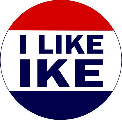
A breakthrough came with the photographic tintype used in Abraham Lincoln’s campaign pin. Next, advances in lithographic printing yielded mass-produced buttons with pithy slogans such as “I Like Ike.” Finally, fashion was tapped to promote candidates, perhaps best exemplified by Richard Nixon’s 1960s mod paper dresses.
Logos enter the mix
Surprisingly, the creation of the candidate logo is a relatively new development, signaling a transition from campaign slogans to personal branding.
There’s good reason for their use: while humans are bombarded daily with thousands of stimuli, MIT neuroscientists have discovered the human brain can process an image in as little as 13 milliseconds.
Previously, the candidate and running mate were satisfied with a font treatment suitable for the bumper sticker, campaign button and lawn sign. The shift from type to logo began in the mid-1960s with the LBJ USA map logo and Hubert Humphrey’s HHH symbol.
In the late 1970s, candidate logos of Robert Byrd and George Wallace had a distinctly disco-era feel; in 1984, the Reagan-Bush retro flag logo meshed perfectly with their catchphrase, “Bringing America Back.”
A tough act to follow
To be effective, a candidate’s logo has to cut through the clutter and serve to unify, mobilize and expand the candidate’s voting bloc.
But can any of the present candidates surpass the potency of Barack Obama’s logo, considered by many to be unrivaled in the history of political brand identity?
 Barack Obama’s campaign logo has been widely praised.Joshua Lott/Reuters
Designers unanimously agree that the circle is the perfect geometric form. Symbolically, the shape represents unity and harmony, the earth and the sun. With this in mind, the design firm Sender translated the “O” into an iconic, optimistic and patriotic seal. At the same time, the pop art Hope poster by street artist Shepard Fairey catapulted the Obama brand into unrivaled territory.
The 2016 slate
Obama’s logo is so effective because it demonstrates the three principles of a successful logo (and these design fundamentals apply equally to commercial products):
The form has to embody “essence of personality” and evoke an intended emotional response.
The mark must be timeless and memorable.
Regardless of the medium, the logo needs to perform in a wide range of formats.
Early in the 2016 race, the logos created for Hillary Clinton, Ted Cruz, Rand Paul and Marco Rubio – along with recent entrants Mike Huckabee and Carly Fiorina – will all be competing for attention in the fast-paced, visually saturated lives of voters.
 Hillary Clinton’s logo is bold, easily replicated and adaptable.Wikimedia Commons
Let’s start with the controversial Hillary logo: the simplicity and directness of her bold blue and red “H” logo conveys rigor, confidence and forward motion. The architectural quality of the blue verticals and red arrowhead is memorable, which compensates for the logo’s overall simplicity (and, some would say, lack of originality).
Significantly, hers is most adaptable to social media; for example, as a Twitter icon, the “H” reduces very well.
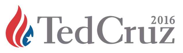
Rand Paul’s logo employs an effective, strong italic font with a flame topper. Like Rand, Ted Cruz uses a flame, albeit a more patriotic one that’s paired with a conservative serif font. The fluid symbol and stiff lettering make an odd coupling, yet together they communicate intelligence and moderation.
Mike Huckabee’s logo is reminiscent of an athletic brand. The bold font with streamlined eagle swoosh telegraphs power, leadership and patriotism.
 Mike Huckabee’s logo mimics those of athletic brands, like Reebok’s old logo.
Marco Rubio’s friendly, geometric logo connotes youthfulness (and the lowercase text is unusual choice, in that the majority of presidential typography integrates capital letters to convey experience and trust). A tiny US map silhouette, which serves as the dot on the “i,” is an unfortunate miscalculation in scale: it’s illegible when the logo is shrunk. Overall, the logo conveys approachability and new thinking.
Like Rubio’s mark, Carly Fiorina’s “Carly for America” logo takes a less formal approach. The star set inside the “A” is a cliché designers have used in logos ranging from credit unions to sports teams. However, emphasis on her first name may not inspire confidence in her leadership experience.
 Marco Rubio made the unconventional decision to use lower case lettering.Joe Skipper/Reuters
Logos in the digital age
With the 2016 election approaching, the biggest shift in how presidential logos will impact the race is connected to the pace and reach of information, which can be instantaneously disseminated via social media.
Success of presidential candidates rests squarely in grasping the idea of Social Physics, the statistical study of how and why peer groups and individuals influence us. By understanding the flow and spread of ideas, candidates can distribute their messages quickly for the benefit of public discourse.
The key, then, for modern, intelligent campaigns, is to produce meaningful, multi-sensory experiences and original content.
To do that, candidates must recognize their logos are more than symbols of their personal brands. As Hillary Clinton’s campaign has grasped, the logo as a social media icon can be a vital link to the vast pool of prospective American voters.
Ellen Tave Glassman does not work for, consult to, own shares in or receive funding from any company or organisation that would benefit from this article, and has no relevant affiliations.
Authors: The Conversation
Read more http://theconversation.com/the-branding-of-an-american-president-40451


