5 charts on what a Newstart recipient really looks like
- Written by Owain Emslie, Associate, Grattan Institute
The Newstart unemployment benefit is all over the news. It’s the subject of a Senate inquiry. Today it will take evidence in Elizabeth, in what used to be Adelaide’s industrial north.
Should it be higher? Should recipients be paid with a cashless card? Or drug tested? Or stripped of their payments if they join climate protests?
To make sense of these proposals it helps to know something about who receives Newstart payments. It’s a picture many of us get wrong.
Read more: Are most people on the Newstart unemployment benefit for a short or long time?
Here’s a heads-up. They are not particularly likely to be young, they are are not especially likely to be men, and more live in regional areas than we might expect.
Here are some facts to give us something to work with, set out in five charts:
Likely to be middle aged
First, Newstart recipients are a lot older than you might think.
Half are over 45. Partly this is because unemployed people aged 24 or younger are more likely to be getting Youth Allowance.
But even if we include unemployed Youth Allowance recipients in the figure, an outsized 45% of all unemployment benefit recipients are over 45. One quarter are over 55.
Women on Newstart are older still: 51% of female job-seekers are over 40, compared with 42% of male job-seekers.
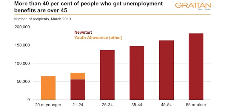 Youth Allowance (other) excludes student and apprentice youth allowance.
DSS Payment Demographics, March 2019
They are older on average than five years ago.
Over the five years to March 2019, the number of people on Newstart aged over 45 swelled by one fifth, and the number over 55 by two fifths. At the same time the number under 45 fell by 16%.
The increase in the number of older people on Newstart has coincided with a sharp decline in the number of older people receiving the Disability Support Pension.
Tighter assessment measures since 2012 have led to a decline in the number of people being assessed as eligible for the Disability Support Pension, forcing many declined applicants on to Newstart.
Less likely to live in big cities
People from the biggest states are less commonly on Newstart.
Someone from Victoria, NSW, or the ACT is about one third less likely to be on Newstart than someone from the rest of the country.
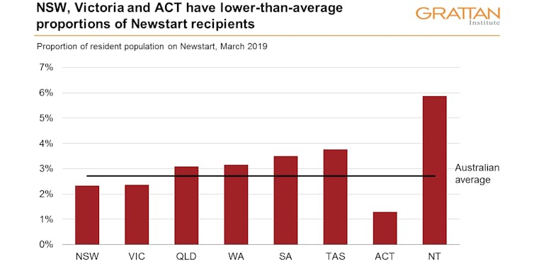 DSS Payment Demographics, March 2019, ABS 3101.0
Rural areas also have higher proportions of people on Newstart than cities.
Someone outside a major city is one and a half times as likely to be on Newstart as someone in a major city. And the difference gets starker the further out you go.
Someone in a “remote” or “very remote” area is more than twice as likely to be on Newstart as someone in a major city.
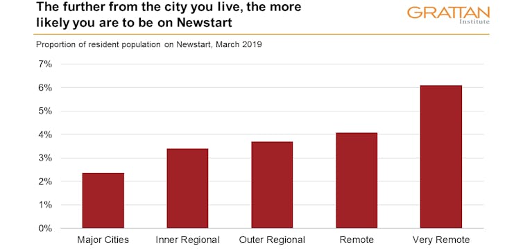 Population at March 2019 is estimated based on ABS data at June 2018.
DSS Payment Demographics, March 2019, ABS 3281
Likely to have been on it for a long time
Contrary to claims by Finance Minister Mathias Cormann and others, Newstart is not always a transitional payment.
It’s true many of the people coming on to Newstart leave it soon after: of those who began receiving Newstart payments in 2017, 63% had come off within 12 months.
But a focus on new recipients ignores the bulk of current recipients, who have been on it for much longer. Someone who has recently begun receiving Newstart payments is far more likely to move off them than someone who’s been on them for a longer period.
As at March 2019, two thirds had been on it for more than a year. One fifth had been on it for more than five years. A significant 4% had been on it for more than ten years.
Older recipients are more likely to have been on it for more than a year, and across all ages, women are more likely than men to have been on Newstart for more than a year.
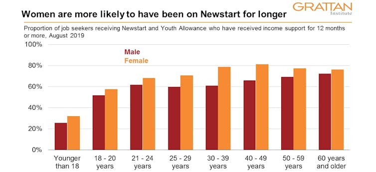 Includes Newstart and Youth Allowance (other) recipients classified as ‘job seekers’. At August 2019, job seekers made up 52% of all Newstart and Youth Allowance (other) recipients.
Labour Market and Related Payments Monthly Profile, August 2019
Tasmanian and Northern Territory recipients are the most likely to have been on it for more than a year; ACT and Queensland recipients are the least likely.
But across all states, a clear majority of recipients have been on it for more than a year.
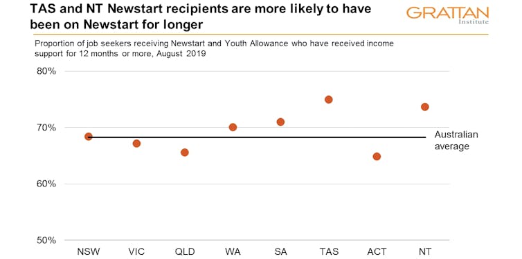 Includes Newstart and Youth Allowance (other) recipients classified as ‘job seekers’. At August 2019, job seekers made up 52% of all Newstart and Youth Allowance (other) recipients.
Labour Market and Related Payments Monthly Profile, August 2019
So next time you picture a Newstart recipient, it might be wise to think of a middle aged woman living outside of the city in a smaller state.
Unless we keep her in mind, we are likely to make the wrong decisions about the rate, about drug testing, and about everything else.
Authors: Owain Emslie, Associate, Grattan Institute
Read more http://theconversation.com/5-charts-on-what-a-newstart-recipient-really-looks-like-125937


