

Data visualisation isn't just for communication, it's also a research tool
- Written by: Seán I. O’Donoghue, Senior Faculty Member at the Garvan Institute, Conjoint Professor at UNSW, and Senior Principal Research Scientist, CSIRO
At the heart of the scientific method lies the ability to make sense from data.
However, this is a challenge in the fast-moving field of biotechnology, where new experimental methods are creating huge amounts of complex data. These data promise to revolutionise healthcare, food and agriculture, but it can be difficult to extract answers to specific research questions from these sets of numbers.
Data visualisation can help. Our eyes deliver information very rapidly to our brains, and then sophisticated pattern recognition abilities take over. Well-designed visualisation tools can reveal discoveries that would otherwise remain buried.
Below we highlight three data visualisation tools we have developed to help life scientists find relevant and useful information amongst the noise. The visualisation principles used in these tools are general and help in many complex data challenges.
Managing large data sets
Proteins and other molecules in our bodies exist as complex 3D structures that constantly change shape and interact with each other. Mapping out the many possible ways that proteins can be structured helps scientists understand how biological processes work, and may inform drug development and treating diseases such as cancer.
Thanks to decades of research worldwide, we now have reliable, evidence-based 3D structures for tens of thousands of proteins, plus more than 100 million models of protein structures.
These models are useful for learning about life’s molecular processes – such as how RNA and proteins are made – however, the large number of models can make it difficult for scientists to pin down which specific models can help answer a particular research question.
To address this difficulty, one of us (Seán O’Donoghue) and colleagues developed Aquaria, a tool using the visualisation principle of “overview first, details on demand”. By using a technique called “clustering”, Aquaria creates a concise visual overview of all structural models available for any specific protein.
 An overview of all 3D structural models available for p53, a protein that protects against cancer. Image created using Aquaria.
S.I. O’Donoghue and C. Stolte, Author provided
An overview of all 3D structural models available for p53, a protein that protects against cancer. Image created using Aquaria.
S.I. O’Donoghue and C. Stolte, Author provided
The image above shows this overview for p53, a protein that protects against cancer. Each cluster of related 3D models can be interactively expanded and explored (bottom of the image), helping scientists find the most useful models suited to address a specific research question.
Once a suitable model is found it is shown (top of the image), with dark colouring used to indicate regions where the structure of the model is less certain. In addition, yellow, blue and green are used to highlight different shapes within the structure, which helps scientists understand how the protein is arranged in three dimensions.
Viewing connections between different datasets
Sometimes, we need to look at data from multiple viewpoints. This is particularly true for a field of research known as sequencing. Sequencing involves determining the precise order of the chemical building blocks that make up DNA, RNA and protein. Knowing these sequences and comparing how they vary between individuals can tell us about mutations that cause disease and reveal how we evolved.
One of the most widely used tools for visualising sequences is Jalview, co-developed by one of us (James Procter), which brings together the huge amounts of data that are created through sequencing.
Jalview employs two principles - “linking and brushing” and “multiple coordinated views” - to bring together different types of information. Jalview also allows other tools to be connected, enabling scientists to navigate through complex, interrelated datasets.
The example below shows a family of proteins known as Aquaporins, which are molecular channels important for water balance and nutrient transport in cells. Aligning these protein’s sequences (close up on right) allows them to be clustered into a tree (shown top-left, with birds-eye view of the protein alignment next door). DNA mutations are mapped onto the protein alignment (shown in red), and these colours also locate the mutations in protein structure (bottom left).
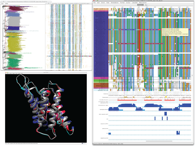 Linked brushing and multiple data visualisations allow potential disease mutations to be identified at the core of Aquaporin, a protein important for water balance and nutrient transport. Image created using Jalview linked with UCSF Chimera.
J.B. Procter, Author provided
Linked brushing and multiple data visualisations allow potential disease mutations to be identified at the core of Aquaporin, a protein important for water balance and nutrient transport. Image created using Jalview linked with UCSF Chimera.
J.B. Procter, Author provided
Visualising networks that change over time
Scientists are aiming to unravel diseases – such as obesity – by studying small changes that take place within our cells.
For example, food that we eat triggers the release of insulin into our blood stream, which then tells fat cells to store rather than release energy. This process ultimately influences our body weight.
Cells are tiny, but they are hives of activity. Thanks to recent advances in techniques such as mass spectrometry, we can now map the tens of thousands of events that are happening within each of our cells in response to hormones such as insulin.
The difficulty for scientists is to try to view this huge amount of information in an accurate and simple way, and one that reflects the chain of events in a cell that matter to our overall health.
One of us (Seán O’Donoghue) and colleagues developed Minardo, an approach that creates a sort of timeline of events that happen inside a cell. Minardo uses the principle that position on a viewing screen is the most effective visualisation strategy. The resulting visualisation helps scientists identify exactly what is going on inside a healthy cell, and what might be different in a diseased cell.
The image here shows (beginning top left, then clockwise) the sequence of events that take place after insulin (in pink) binds to the surface of a fat cell. The consequences of insulin binding include switching off the release of energy stores from the cell (around 1 minute after insulin binds), and switching on energy storage (around 5 minutes after insulin binds).
 The sequence of key events within a human fat cell following insulin binding to its receptor (top left, pink). Image created using Minardo.
D.K.G. Ma, C. Stolte, J.R. Krycer, D.E. James, and S.I. O’Donoghue, Author provided
The sequence of key events within a human fat cell following insulin binding to its receptor (top left, pink). Image created using Minardo.
D.K.G. Ma, C. Stolte, J.R. Krycer, D.E. James, and S.I. O’Donoghue, Author provided
VIZBI, an international visualisation community
In building these tools, we aim to visualise data as clearly as possible, so the viewer can focus on the science.
Aquaria, Jalview and Minardo are freely accessible and used by tens of thousands of scientists and students worldwide - an accomplishment that we are proud of.
However, our tools address only three specific research questions – biology has thousands more. Tailored visualisations of this kind need an interdisciplinary team, take months to prototype and require years to develop into robust and usable tools.
Realising this, in 2010, we created an international initiative called VIZBI to connect tool-builders and raise the standard of data visualisation in biology. In June 2017, VIZBI and associated events came to the Asia-Pacific region for the first time.
With the overwhelming complexity of biological data, substantial time and effort is required to create effective visualisation tools not just for communication but also for research itself.
Authors: Seán I. O’Donoghue, Senior Faculty Member at the Garvan Institute, Conjoint Professor at UNSW, and Senior Principal Research Scientist, CSIRO


