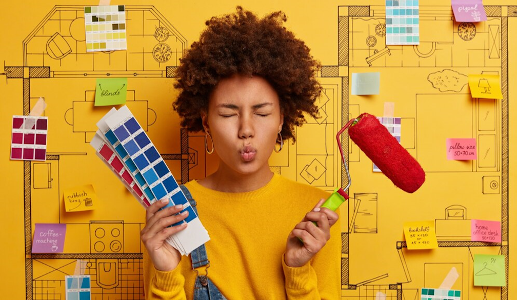
10 Common Interior Design Mistakes and How to Avoid Them

Creating a beautiful and functional space can be both exciting and daunting, especially when it comes to interior design. While it’s fun to transform a room, it’s easy to make design mistakes that can hinder the overall look and feel of your home. The good news is, most of these mistakes are easily avoidable once you’re aware of them. Here are ten common interior design pitfalls and tips on how to steer clear of them.
Choosing the Wrong Size Furniture
One of the most frequent design missteps is selecting furniture that’s either too large or too small for the room. Oversized furniture can make a space feel cramped, while pieces that are too small can leave it looking sparse and incomplete.
- How to avoid it: Measure your room and consider the flow of traffic before purchasing furniture. Use masking tape on the floor to outline potential furniture pieces to ensure they fit appropriately.
Ignoring Scale and Proportion
Scale and proportion refer to how objects relate to each other in size within a space. For instance, a massive chandelier in a small room or tiny artwork on a large wall can throw off the balance.
- How to avoid it: Ensure that all elements in the room – furniture, décor, and lighting – are proportional to one another. A cohesive balance will make the space feel harmonious.
Forgetting About Lighting
Lighting plays a critical role in setting the mood and functionality of a space, but it’s often an afterthought. Too little light can make a room feel dark and uninviting, while harsh lighting can create a cold atmosphere.
- How to avoid it: Layer your lighting with a mix of ambient, task, and accent lighting. Use natural light where possible, and incorporate dimmers to control brightness.
Overcrowding the Space
It's easy to get carried away when decorating, but too much furniture and décor can make a room feel cluttered and overwhelming.
- How to avoid it: Embrace the ‘less is more’ philosophy. Opt for a few key pieces that make a statement rather than filling every corner. Allow your space to breathe.
Following Trends Too Closely
While it's tempting to follow the latest trends, designing a room based solely on what's in vogue can quickly leave your space feeling dated.
- How to avoid it: Incorporate timeless elements that will stand the test of time, and use trends sparingly in accents or smaller, easily replaceable items. This way, you can refresh your space without a complete overhaul.
Choosing the Wrong Paint Colour
Colour is a powerful tool in interior design, but choosing the wrong shade can drastically alter the feel of a room. Bold colours can be overwhelming, while too many neutral tones may result in a bland space.
- How to avoid it: Test paint samples on your walls before committing. Observe how they look in different lighting throughout the day, and consider how the colours will complement your furniture and décor.
Pushing All the Furniture Against the Walls
Many people instinctively push furniture against the walls to create more space in the centre of the room. However, this can result in a room that feels disconnected and less inviting.
- How to avoid it: Try floating your furniture away from the walls to create a more intimate and functional layout. This technique can also make a room feel more spacious by encouraging better flow.
Neglecting to Create a Focal Point
Every room needs a focal point – a place where the eye is naturally drawn. Without one, a room can feel disjointed or visually confusing.
- How to avoid it: Choose a focal point that enhances the room, such as a fireplace, a piece of artwork, or a striking iron door design. Once established, arrange furniture and décor around this point to create balance and harmony.
Mixing Too Many Styles
It’s possible to create an eclectic look by mixing different design styles, but combining too many can result in a chaotic space with no clear theme.
- How to avoid it: Stick to a cohesive style or limit yourself to two or three styles that complement each other. This will create a more unified and thoughtful design.
Overlooking Functionality
A room’s design should not only be aesthetically pleasing but also practical. Sacrificing function for form can lead to frustration down the line.
- How to avoid it: Always consider how the space will be used and choose furniture, layout, and décor that accommodate those needs. For example, if you have children or pets, opt for durable materials and furnishings that suit your lifestyle.
Final Thoughts
Interior design is about striking a balance between aesthetics and functionality. By avoiding these common mistakes, you can create a space that is not only beautiful but also comfortable and practical. Whether it’s through choosing the right size furniture or incorporating a statement piece like an iron door design, paying attention to these details will help you achieve a polished, cohesive look that stands the test of time.


