Design makes a place a prison or a home. Turning 'human-centred' vision for aged care into reality
- Written by Jan Golembiewski, Researcher, University of Technology Sydney
The Royal Commission into Aged Care left organisations that provide housing for aged care wondering how they will put its recommendations into effect. Most of these recommendations relate to the models of care and levels of staffing in homes. Put simply, in the architectural rabbit warrens that typify aged-care facilities, there can never be enough staff to manage every nook.
Models of care are also difficult to change when the architecture is obsolete. Yet these difficulties aren’t detailed in the report. It barely mentions architecture. Only two of the 148 recommendations relate specifically to architecture, numbers 45 and 46: to improve the design of residential care accommodation; and to provide “small household” models of accommodation.
But don’t be mistaken. Architecture has a profound impact on how we live our lives, work and respond socially.
Read more: 4 key takeaways from the aged care royal commission's final report
If architects are able to work with some basic design rules – to design to a vision, with simplicity and a non-institutional design language – architecture can play a role in implementing the bulk of the recommendations. But, if the importance of design is neglected, obsolete architectural models will undermine the best efforts to reform the models of care.
We can design to remove restraint
Architecture is a critical element of “embedding a human rights-based and human-centred approach to care”, the focus of chapter 3 of the royal commission’s report. To understand the relationship between architecture and human rights, consider how human rights are taken away: look at prisons, detention centres, mental health facilities and even the residences where we care for our elderly citizens. Invariably, it’s architecture that stifles the freedom of movement, the dignity, the freedom of association, choice and other rights.
Read more: The bad buildings scream – lessons from Don Dale and other failed institutions
The commission estimates architectural solutions to seclusion and other forms of physical restraint are used on 25-50% of all residents of high-care residences. These restraints can look innocuous – including “seating residents in chairs with deep seats, or rockers and recliners, that the resident cannot stand up from”. But for residents who can’t get up on their own, deep seats restrict their freedom of movement and ability to make their own choices about as much as handcuffs do.
 When a person can’t get up from a seat unaided, it becomes a form of restraint.
Shutterstock
The forms of restraint (including in high-care aged-care residences) are increasingly disguised, but a locked door remains impenetrable even if it’s made of clear glass. Along with fences and high walls, such features are designed to keep some people in and others out.
Read more: Retire the retirement village – the wall and what’s behind it is so 2020
Or we can design for quality of life
If people fail to see how the design of a prison is the primary instrument for imprisonment, then it’s also hard to comprehend just how much good architecture improves people’s circumstances and well-being. But a well-designed aged-care building is replete with wholesome invitations to do such things as explore gardens without putting residents at undue risk.
In turn, spending time outdoors helps prevent “sundowning” – people with dementia may become more confused, restless or insecure late in the afternoon or early evening. It also improves the resident’s experience (personal well-being and satisfaction). Recent unpublished data (in review) shows time outdoors even protects against viral flu-like infections.
And that’s just one example of the benefits of good design. All good architectural choices have similarly positive effects.
3 principles for human-centred design in aged care
Principle 1: projects are driven by a vision that maintains and enables human dignity, even for people with cognitive impairment.
A vision includes a single, well-articulated concept that cannot be dismissed or ignored. The vision creates a hierarchy in which important things are valued more than anything else. A vision that makes human dignity a priority ensures other functional or pragmatic concerns do not lead to human rights being deprioritised.
A good vision isn’t just words or intentions. It involves concrete decisions that are armed with bravery and honesty. Bravery because a good vision always aspires beyond known benchmarks and guidelines. Honesty, because a good vision isn’t shy about speaking the truth.
The diagram below shows an example of a vision in which high-care aged-care residences were to be incorporated into a new precinct for the University of Woolongong. The vision prioritised human centredness – a human-centred workplace, a student-centred learning environment, patient-centred aged-care residences and a person-centred environment overall.
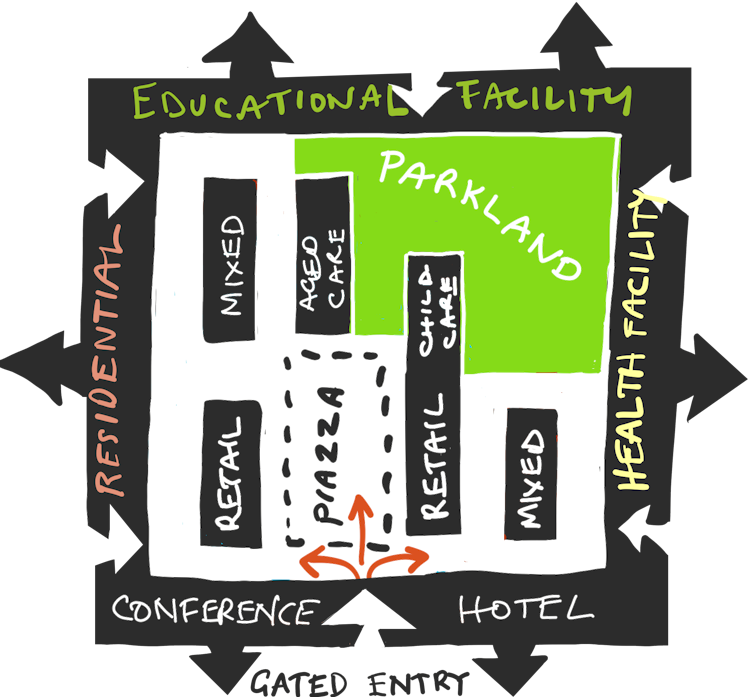 Concept drawing of a human-centred aged-care residence.
© Psychological Design, Author provided (No reuse)
The above vision led to this conceptual diagram.
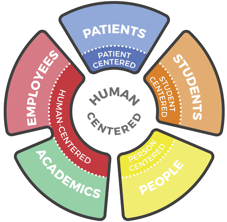 Conceptual diagram of groups of people to be served by design of new precinct.
© Psychological Design, Sydney 2018, Author provided (No reuse)
The conceptual diagram was developed as a masterplan.
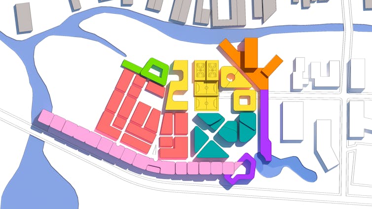 Masterplan of mix of facilities including high-care aged-care residences in new precinct.
© Psychological Design, Sydney, 2018, Author provided (No reuse)
In this concept, the educational, residential (non-aged-care) and health facilities make natural walls around a shared village. Car-free streets, cafes, shops, parklands and a distributed residential aged-care facility create a pleasant and safe environment for everybody. The exterior buildings are accessible from both sides for students and staff, but not for high-care residents unless they are accompanied.
Read more: Aged care isn't working, but we can create neighbourhoods to support healthy ageing in place
Principle 2: keep it simple.
As cognitive abilities decline, this reduces people’s capacity to deal with complexity. So keep design simple, with destinations that are visible and clear.
Think about turning all bedrooms inwards to provide immediate access to common spaces, activities and gardens. The reception, all offices and commercial facilities can face outwards, and be invisible to residents.
Simplifying the layout also aids staff. Hidden spaces and doors to unsafe places cause anxiety for residents and staff alike, adding to the staffing burden.
Simple design doesn’t mean plain. It means keeping plans simple - especially for the residents, who have all they might need (and all they want) immediately visible. All no-go areas are hidden.
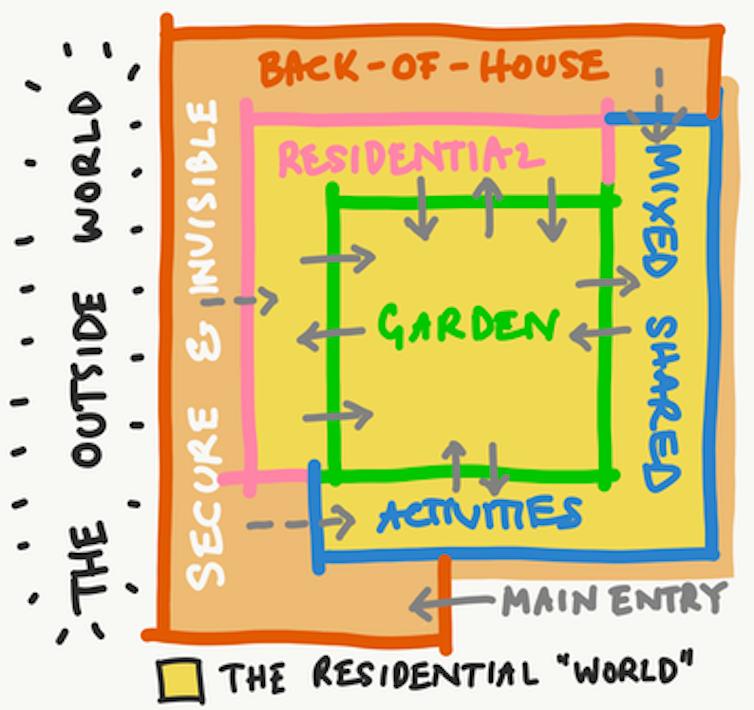 It’s essential to keep design simple for the benefit of residents of aged-care facilities.
© Psychological Design, Sydney, 2021, Author provided (No reuse)
Principle 3: Residential means non-institutional.
Much as they assist with routines of care, residences are residences. They are ruined by staff stations and institutional touches like vinyl flooring, strip lighting and furniture lined up against the walls.
Residents’ bedrooms must be customisable – meaning people should be able to hang their own art, listen to their own music, and have their own furniture and belongings. After all, these rooms are where people live. And how can people feel at home, unless they are allowed to feel at home with their surroundings?
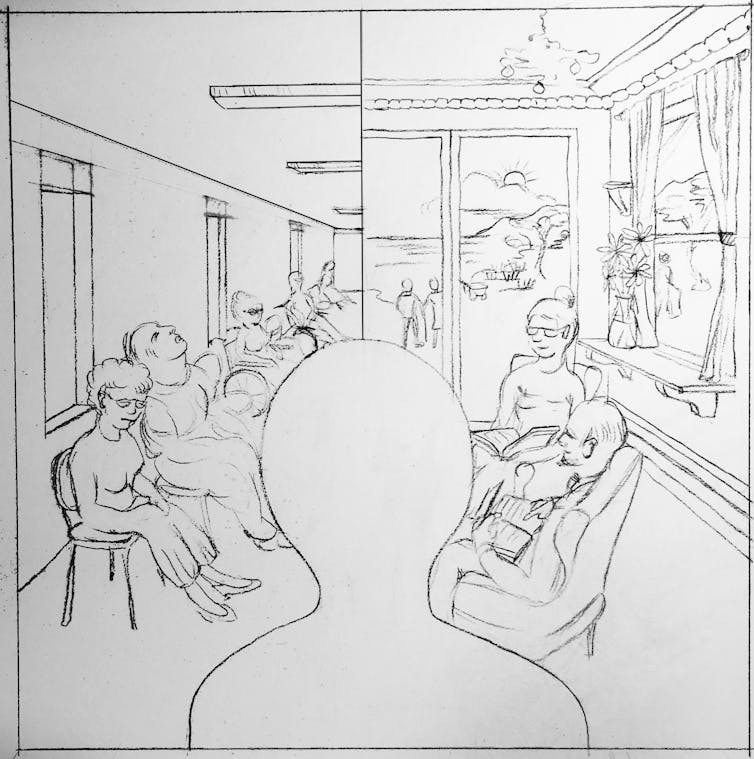 Aged-care facilities can be institutional (left) or residential (right), it’s all a matter of priorities in their design.
Jan Golembiewski, © Psychological Design, Sydney 2020, Author provided (No reuse)
The left image shows a relatively typical scene in an Australian residential-care facility. The details are institutional – the windows, the lighting, the residents lined up along a wall. The opposite (right) is a residential milieu. Which one would you choose?
Authors: Jan Golembiewski, Researcher, University of Technology Sydney


