From army barracks to shopping malls: how hospital design has been a matter of life and death
- Written by Julie Willis, Professor of Architecture and Dean of the Faculty of Architecture, Building & Planning, University of Melbourne
Welcome to the first article of our Designing Hospitals series, where we explore how architecture and design shape our hospitals and medical centres. Today, we look at changes in hospital design since convict times, from simple huts to supportive spaces that reduce patient anxiety and stress.
Although architecture surrounds us and we engage with it daily, most assume design is benign or inert. Yet it shapes our actions and interactions. In the hospital, design can make the difference between life and death.
Architecture has played a crucial role in the hospital: as an instrument of status, of hygiene, of therapy, of control and, more recently, of support.
Read more: Not just a pretty interface: good design goes beyond looks
As far as we know, the first hospital in Australia was built in Sydney in 1788 and Governor Phillip quickly prioritised building it. It was just the third permanent building colonists erected after the governor’s house and commissariat store (which provided food and other supplies).
The hospital was little more than a dirt-floored hut. It was soon replaced by a prefabricated hospital that arrived with the Second Fleet.
Sydney’s third hospital — the infamous Rum Hospital — was a grand Georgian-style edifice.
The creation and design of these three hospitals said much about their status as key buildings in the colony, but little about the care provided within.
The design of early hospitals in Australia was based on military barracks, rather than the hospital design traditions of Britain. They housed the sick and dying with minimal, if any, provision made for adequate ventilation, sanitation, treatment or medical supervision.
Florence Nightingale revolutionalised design
Reform of hospitals came with the work of nurse Florence Nightingale. Her experiences in the Crimean War led her to write Notes on Hospitals (1858), which revolutionised the way hospitals were designed.
The Nightingale ward was a pavilion containing 24-30 beds in two rows, with a nurses’ station and public entry at one end and an ablution (washing) block at the other.
Windows were placed between each bed, and each bed was a set distance apart, to minimise cross-infection. Each pavilion was separate, for ventilation purposes; later examples stacked the still-separated pavilions into multi-storey blocks.
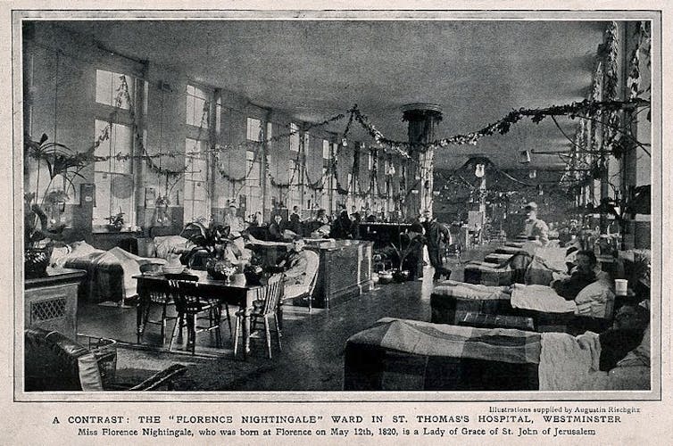 Florence Nightingale revolutionised hospital design. Note the placement of the beds and windows in this Nightingale ward at St Thomas’s Hospital, London.
Wellcome Trust
Australian hospitals from the 1870s to the early 1920s used Nightingale’s principles and are known as pavilion hospitals. You can still see examples at the former Queen Victoria Hospital, Melbourne, and the Royal Prince Alfred Hospital, Sydney.
Then our understanding of how disease was transmitted changed. We moved away from the theory of miasma (where bad air was thought to carry disease), undermining the need for the Nightingale ward.
Instead, the work of Louis Pasteur and Joseph Lister, reinforced by microbiologist Robert Koch in the 1870s, became prominent. This was the idea that certain diseases were caused by germs invading the body.
Nevertheless, emphasis was still placed on a “broad environmentalism” for the hospital. This included ventilation, hygienic surfaces, and restorative natural settings such as gardens.
Technology and therapy shaped design
In the 1920s, two distinct trends in hospital design were evident.
In the first, the Americans focused on technology (ventilation, air conditioning, therapeutic and diagnostic equipment), efficiency (industrial kitchens and laundries, centralised stores) and scale (planning, position, function). One example was the behemoth of the Columbia-Presbyterian Medical Center in New York (1928).
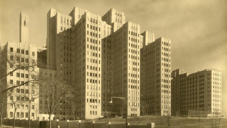 The Columbia-Presbyterian Medical Center in New York was a nod to technology, efficiency and scale.
Courtesy Columbia University Irving Medical Center
In the second, the Europeans were designing hospitals as instruments of therapy. Patients had access to fresh air and sunlight (heliotherapy, particularly to treat tuberculosis and skin diseases).
To directly access sun and air, bed-bound patients were placed on wide balconies and fully glazed rooms (solaria). Examples here include the Krankenhaus Waiblingen, Germany (1928-30), and the Paimio Sanatorium, Finland (1929-32).
By the early 1930s, these trends had been distilled by the entrepreneurial architect Arthur Stephenson into a series of world-leading Australian hospitals. These included the Mercy Hospital, Melbourne (1933-35), and the King George V Hospital for Mothers and Babies, Sydney (1939-41).
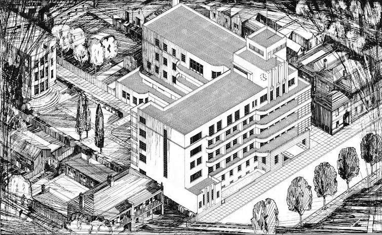 The Mercy Hospital, built in Melbourne in the 1930s, combined the best American and European ideas to reform hospital design in Australia.
State Library of Victoria, Author provided
Off to surgery
Inside the hospital, design made a dramatic difference to patients. In the operating theatre, for example, the needs of both patient and surgeon dictated design innovations.
The presence of oxygen and ether (for anaesthesia) made explosion a distinct possibility. So designers paid particular attention to flooring (to minimise the buildup of static electricity) and the temperature and humidity of the air (to minimise sparks).
Lighting had to be shadowless, dustless and not too hot; the surgeon and anaesthetist needed to be able to see but not be blinded by the lights.
Instruments had to be sterile, operating theatre personnel needed to scrub and gown up, and air needed to be purified.
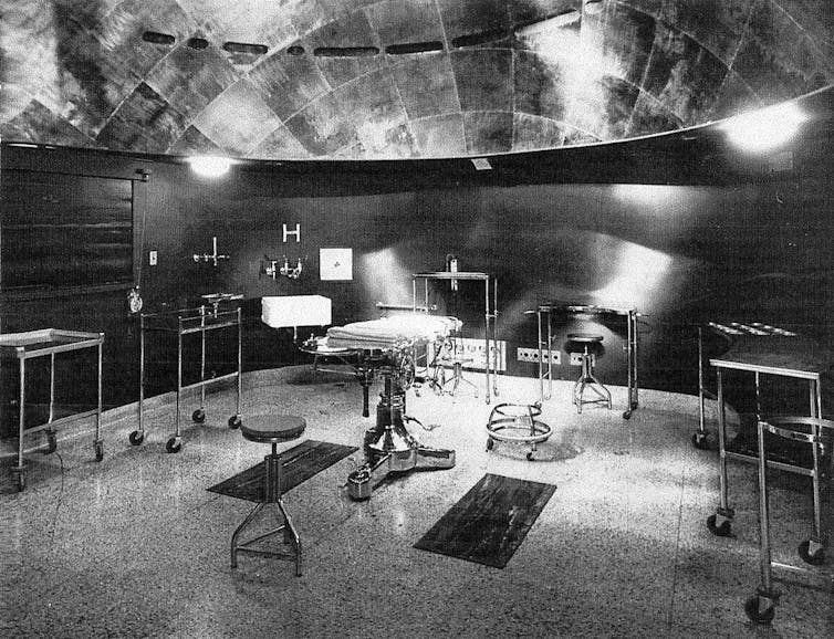 King George V Hospital operating theatre (c1941). Note the hemispherical ceiling shape, lighting and gleaming surfaces. Architects: Stephenson & Turner.
Author provided (No reuse)
This led to the first air-conditioned spaces in the hospital and experimentation with paraboloid-shaped theatres with embedded lighting; green walls, drapes and gowns (to minimise eye fatigue) became ubiquitous; and there were separate pathways or systems for instruments, patients, staff, and air handling (such as HEPA filters) to maintain the highest possible levels of cleanliness.
For the patient, these innovations increased their likelihood of survival and decreased their rates of infection.
Towards sealed boxes
The development of drug-based therapies, particularly penicillin, from the 1950s meant hospitals no longer needed balconies for sun therapy. And the push to air-condition the whole hospital led to them becoming hermetically sealed boxes.
Less emphasis was placed on the restorative and healing power of the environment, more on precision and efficiency of medical practice.
Architecturally, hospitals serviced the needs of medicine rather than the patient. Concern was for efficiency of the doctor or nurse, with a focus on function rather than feeling.
Hospitals became systems, concerned with productivity and flexibility, such as the McMaster University Health Sciences Centre, Canada (1967–72). In Australia, the uncompromising style of the Footscray Psychiatric Centre (about 1969) demonstrated the closed box the hospital had become.
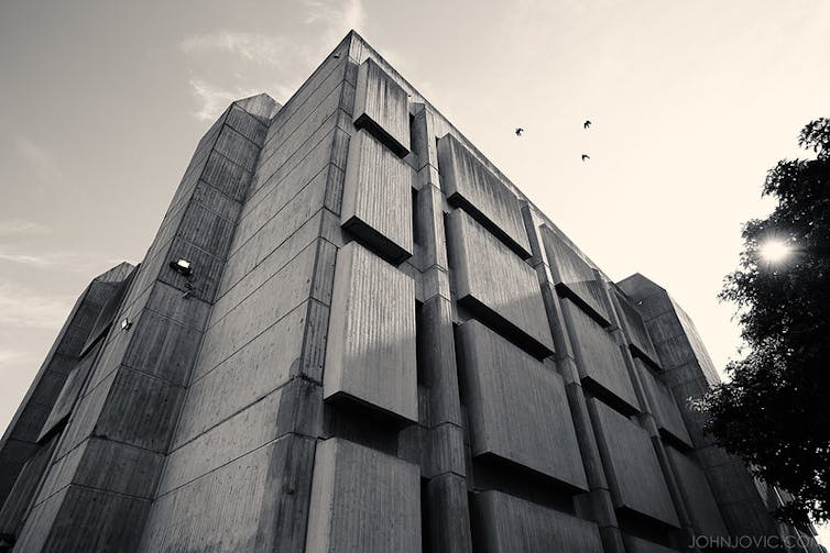 Footscray Psychiatric Centre, a closed box and uncompromising style.
(Copyright John Jovic, used with permission, no re-use)
The human element
From the 1970s, there was increasing understanding of the interconnections between humans, health and environments.
A seminal paper in 1984 on how a view from a hospital window could influence recovery from surgery validated the links between patient outcomes and building design. Hospital design needed to change to benefit patients.
Like shopping malls, for the people
A revised approach was evident from the 1980s. This saw the public spaces of hospitals consciously de-institutionalised and modelled as shopping malls — busy places of apparent normality.
More recently, there has been emphasis on patient-centred design that considers ways hospital design can support patients at every point, reducing stress and anxiety and making them more receptive to treatment.
A fly-through of the Peter MacCallum Cancer Centre in Melbourne (built in 2016) shows its emphasis on patient-centred design.Australian hospitals have led the way in this approach, such as the Peter MacCallum Cancer Centre, Melbourne (2016) and Queensland Children’s Hospital (2014), Brisbane.
Architecture has played an active role in the effectiveness of hospitals over centuries. They’ve not just been containers for care. Hospital design has enabled, encouraged and supported patients and medics to better standards of therapy and treatment.
Authors: Julie Willis, Professor of Architecture and Dean of the Faculty of Architecture, Building & Planning, University of Melbourne


